Poster Design: B40 RUSH
My forty favorite RUSH songs — A tribute to a great band as they finish their careers.
01
02
03
04
05
06
07
08
09
10
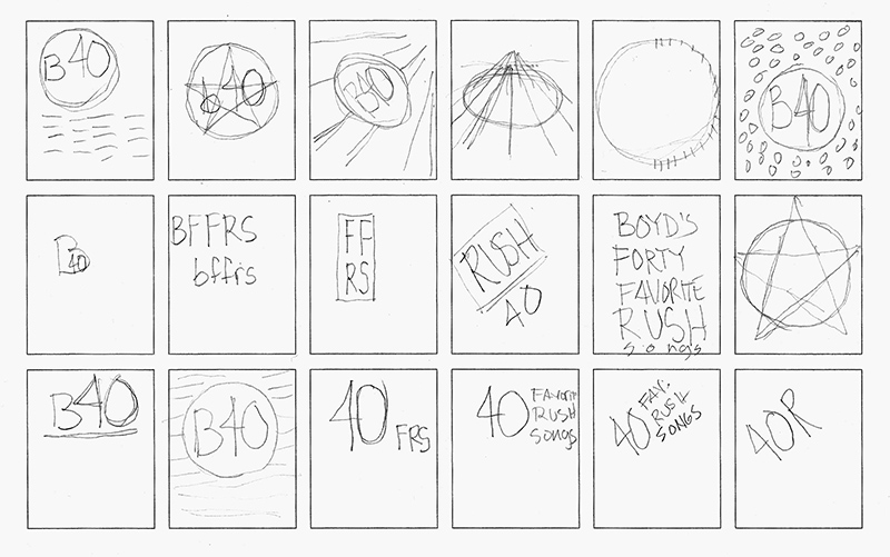
Working Out Ideas
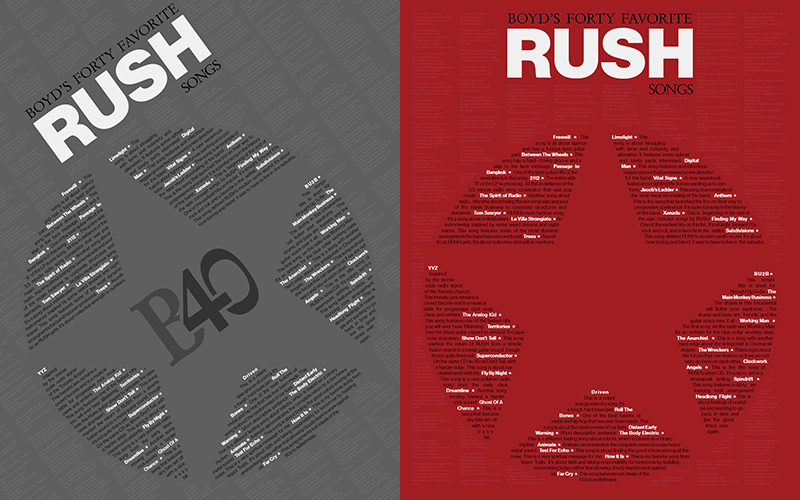
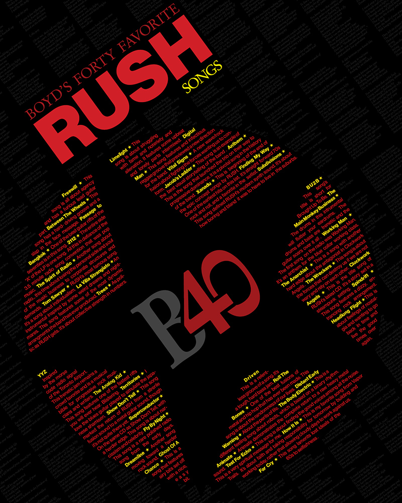
The idea here was to create a visual structure for the typography that would make up my list of songs. In addition to song titles, I decided to include comments about each song.
I had experienced some success with a rotated composition and I think a few of these thumbnail show the attempt to use this technique. The Red Star of the Solar Federation was a symbol used in the narrative of early RUSH from the seventies, so this geometric arrangment was a part of these early musings about arrangment and structure.
Type and Hierarchy
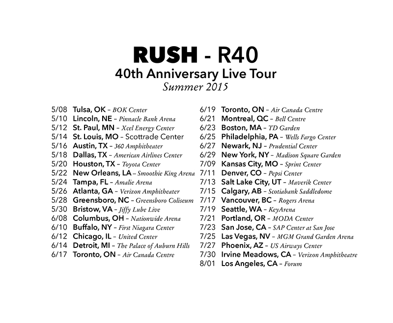
This list of tour dates for RUSH's last tour was a good exercise in developing approaches to hierarchy that facilitate the readability of this kind of information in list form. This was a good prep exercise for getting ready to deal with the list of songs.
The Austin date on May 16, 2015 was the concert I attended with my sons from this tour. It was a great night of music, but I was worried at indications that this could be RUSH's last tour.
Layouts
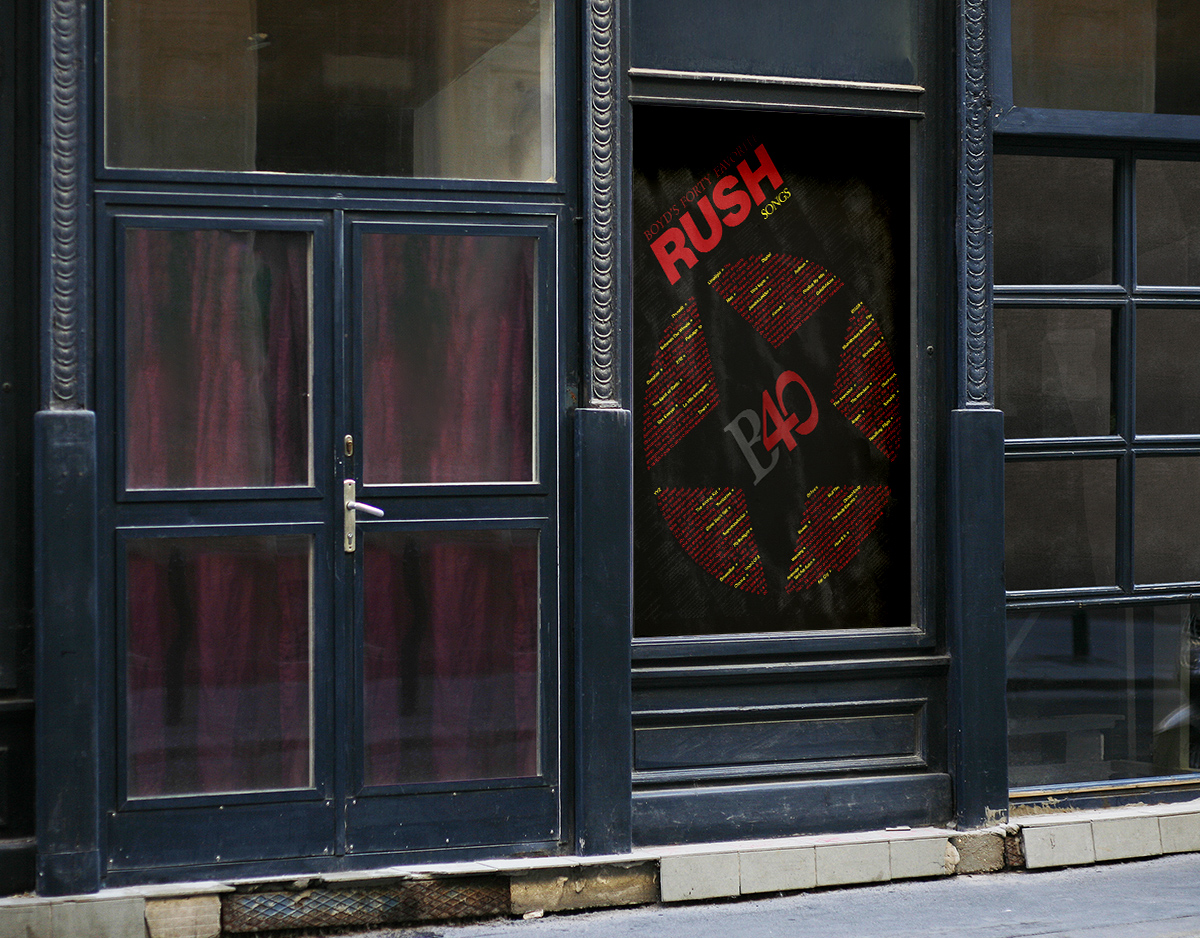
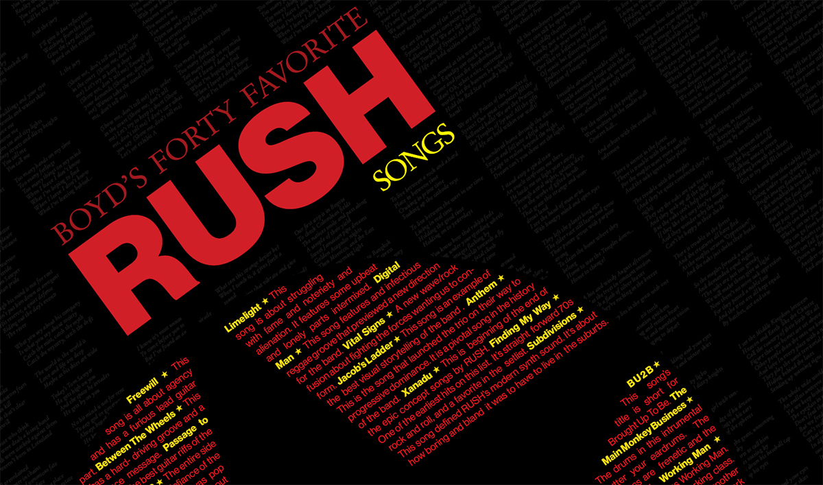
The red star featured in the 2112 album from 1976 is an upright five-pointed star and not a pentagram. The star is circumscribed by a red circle. This symbol has probably become the most iconic symbol for RUSH. For this reason I chose it as a structure for my list of songs.
The problem with the upright star is that as a geometric form it is fairly static as a basis of aligning type. Rotating counter-clockwise helps this and turns the traditional star into and inverse star. This provided the baseline that created the dynamic feel that I was looking for
Finished Layout
I talk about hierarchy a lot because it is a major consideration with all the design that I do both on the web and for print. The approach to hierarchy here was to use scale, value and color to manage that goal. This was because the song titles were important, but had to be rather small. For this reason the background was made black, the heading and title type was made red, and the song titles were made bright yellow. The word "SONGS" in the sub-heading was also made yellow to relate to the song titles and provide a meaning to the song titles.
The B40 branding was created as a center-piece but not as the top level hierarchy which was saved for the name of the group. Lyrics to the songs serve as a texture backdrop to the graphical treatments in the foreground. These recall muuch of the lyric typography in the album sleeves of many of RUSH's vinyl albums.