Web Design: GNN
This project is a design of a text-heavy website based on an Information Architecture. The website is GNN (Genetics News Network), a genetics news and research website.
01
02
03
04
05
06
07
08
09
10
Information Architecture
Information Architecture is the structure and organization of information. This structure is designed to enhance the usability of the information and maximize the delightfulness of its use for those who need to interact with it and use it.
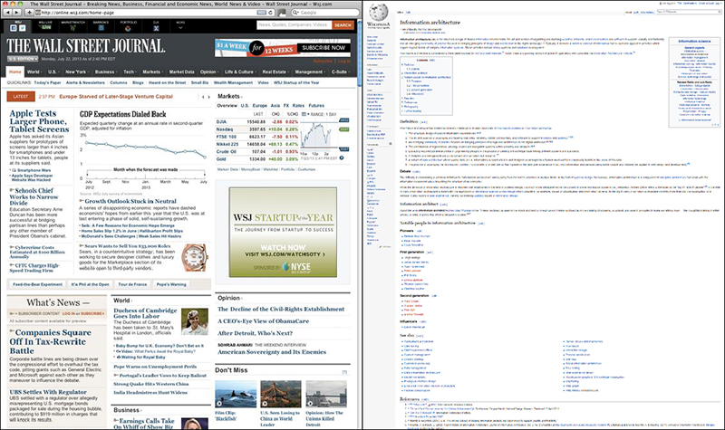
Most online periodicals, like The Wall Street Journal, are examples of robust information architectures. Wikipedia is another. Directories such as the white pages and craigslist are also examples of information architectures. Information Architecture is the arrangment of ontology, taxonomy, and choreography in order to please or serve the user.
The GNN IA
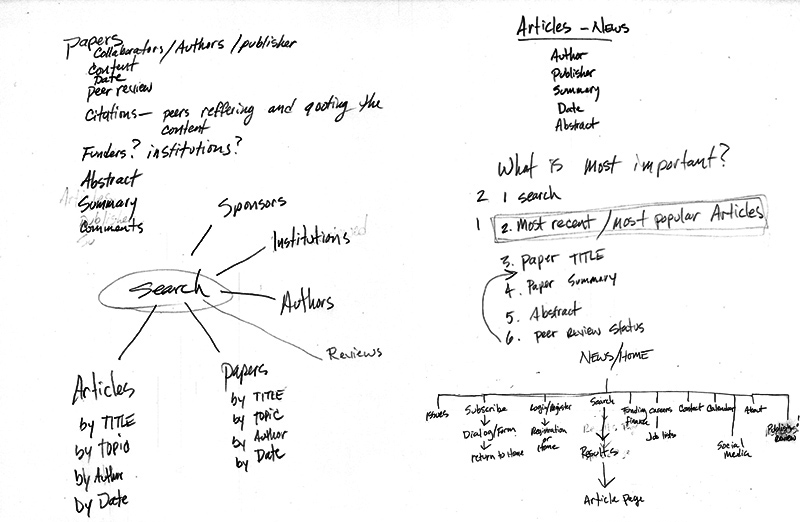
My first task was to come to an understanding of the IA of the Genetics News Network. This website was to have at its core, a search engine whch allows users to locate and review research articles and news articles by referencing various key metadata. This metadata consists of article factors such as article title, author, abstract content, article content, article tags which are based on subject matter and categories, ratings, peer reviews, and reader comments and reviews.
Other areas and pages on the website were to include registration and login, subscriptions, periodical issues, careers, funding and donations, contact, calendar, about, and social media areas.
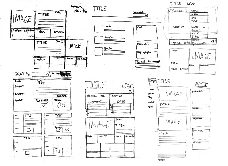
Planning & Sketching
These images contain various attempts to visually manage all the content on the two main pages, which are the homepage or featured article page, and the search results page. Visually the principles of grouping and hierarchy are used to create strategies to manage the information in a way that communicates enough in a pleasing visual way that helps each piece to not get lost in a sea of information.
Not shown is the work I did to create a Persona and Scenarios to assist in testing the prototypes. These aid in creating a heuristic analysis in the testing phases to bring the needed issues to the forefront for iterating the design until design goals are met. The Persona represents the target user base. The scenarios help create a testing script and focus on the key tasks the user must perform to accomplish their goals.
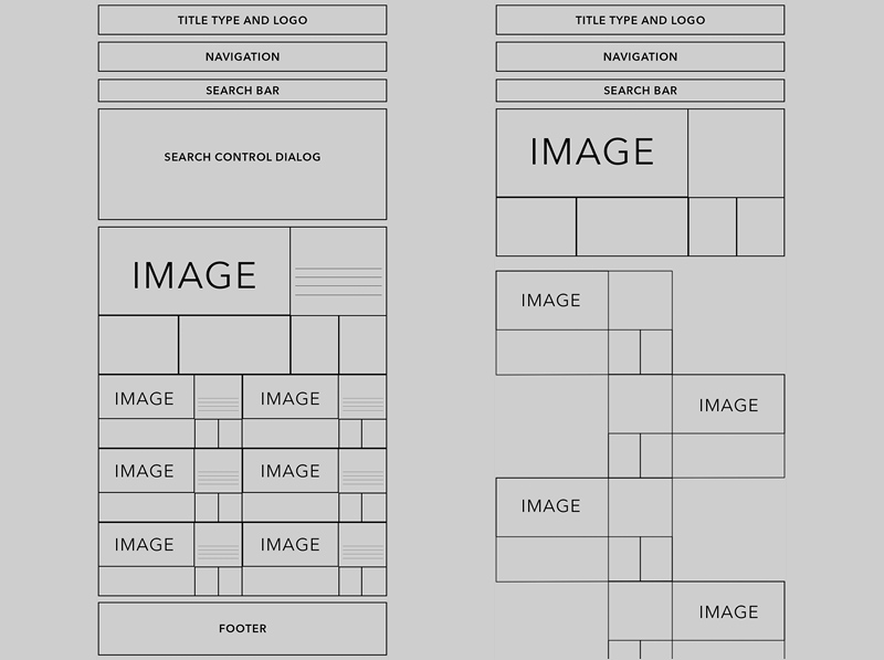
Wireframes & Mockups
These are two of the wireframes for the featured article and search results pages. These were used in the first prototypes I created for testing. In this early wireframe form I was able to see if every major feature and function had appropriate grouping and visibility that was easily located.
The mockups were created after the first round of testing and then were tested again before creating the first digital mockups.
Drafts
These drafts of the first digital mockups I created based on the feedback from testing of my wireframes. Initial color choices are also shown. The color scheme is basically a complementary scheme using de-saurated aqua blue/green with orange accents and later adding a red logo mark.
The drafts were used in the first digital prototype and tests. Typography was also a big consideration, considering the need to manage hieracrhy with so much type visible on the pages of the website. My decision was to keep it simple and use a single flexible typeface. Klint is an open sans-serif typeface that has a modern flavor and is equally good as with copy and headings. This typeface is available from several sources as a free offering or as part of a low price bundle. Hierarchy is established in the typography by using font size, weight, spacing or grouping and color.
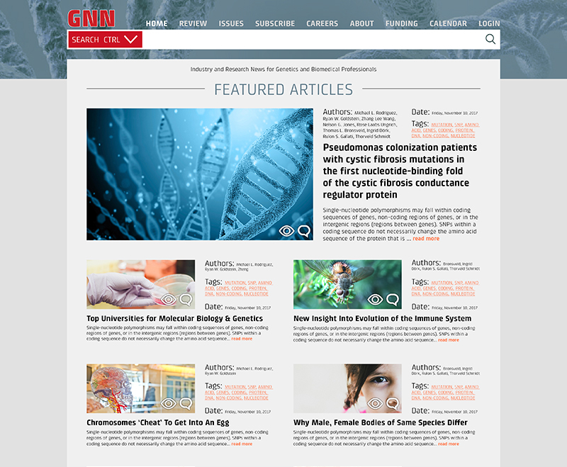
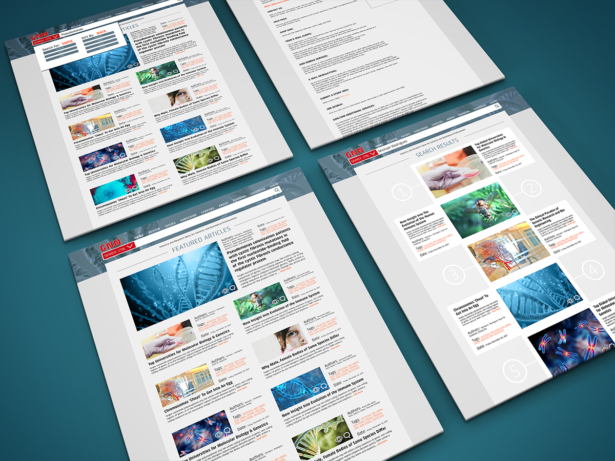
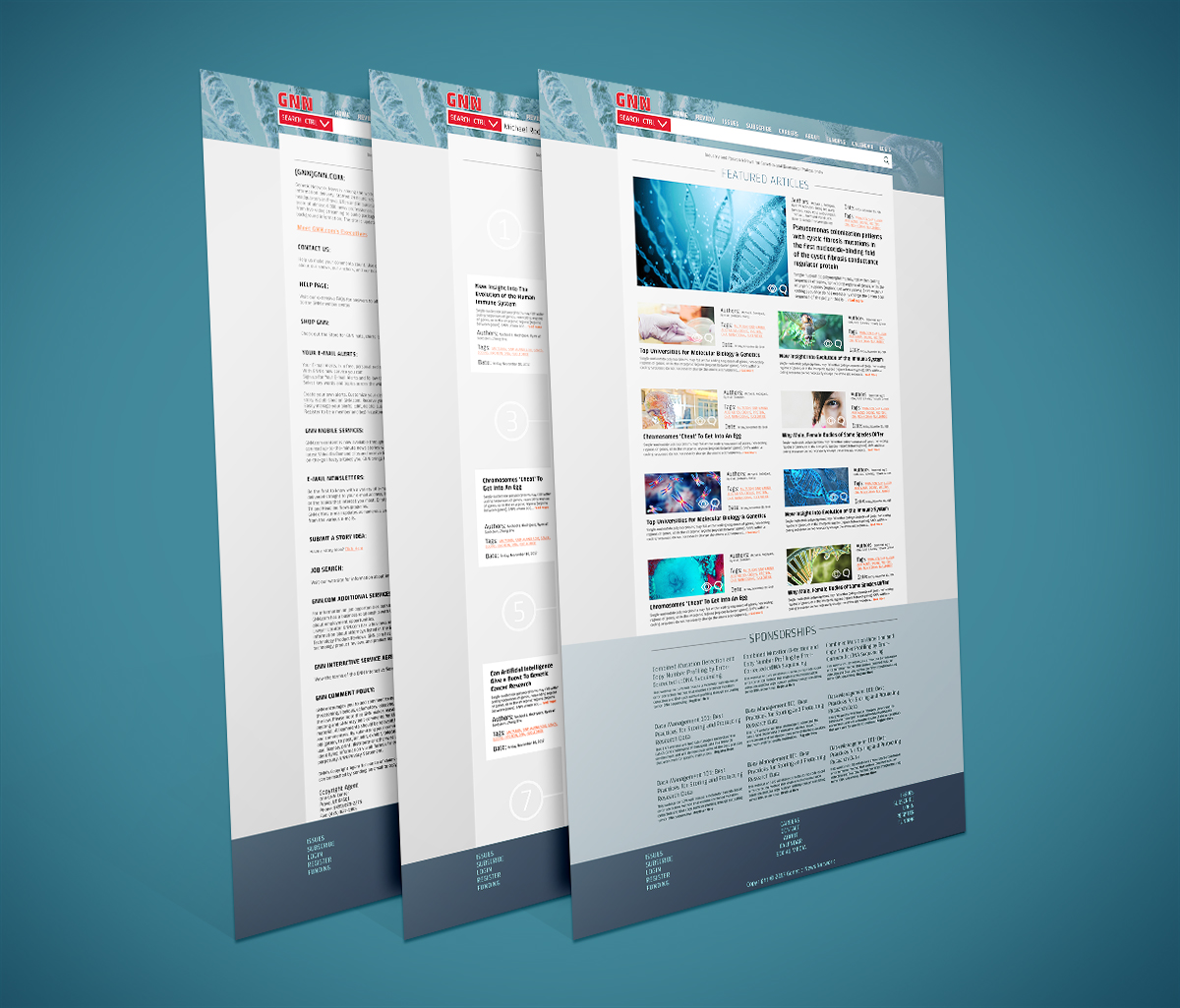
Featured Articles Page
This page is the GNN home page. It is updated daily and features information on the state of the genetics and bio-engineering research fields. If there is breaking genetic related news, this is where you'll see it first. Because the focus of the site is on searchable research articles, the website design needs to address how to display the information so there is minimal chance that an article gets lost on the page.
So, rather than just packing everything tightly in the available space, the site allows each article space to breathe and relies on scrolling to make up for the use of whitepace for readability. Given the ease of scrolling and the fact that mobile devices have made us accept scrolling more than in the past, this is a good trade-off to make.
To see the full featured articles layout, click here.
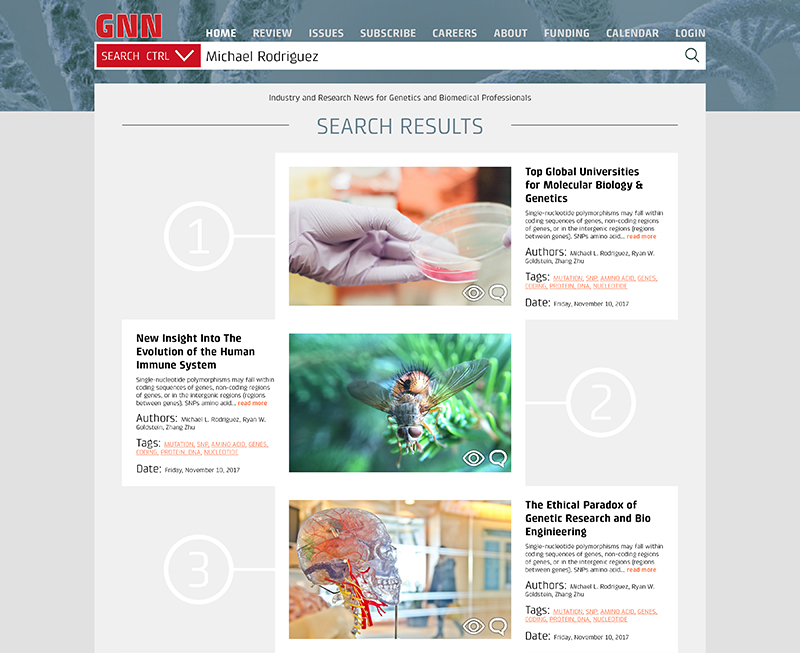
Search Page
The search page has similar goals, but is distinct in layout. The repeating pattern that is present in most lists on the web is how many of the listed items become invisible to the eye. Because the search rank feature is a key way to so relevance in the results, the layout goes to great lengths to offset each result from it's adjacent ranked result. This allows each article result to be more visible, and the rank to be clearly displayed.
To see the full article layout, click here.
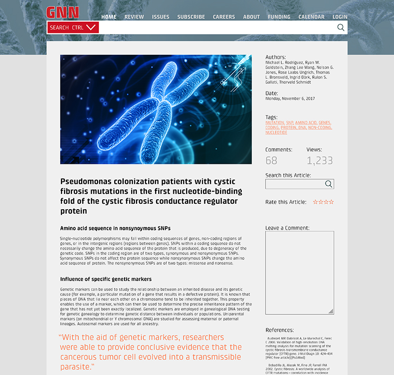
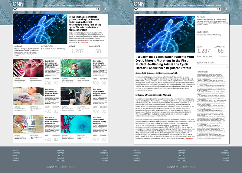
Article Page
Unique to content heavy websites is the article in long form. This design shows an article in this format. The important thing is to appropriately break up the text information into topical sections with headings and images that help relate the viewer to the content. Also of note are the reviews, comments, references and other website features that allow interactivity with readers and the online research community.
To see the full article layout, click here.