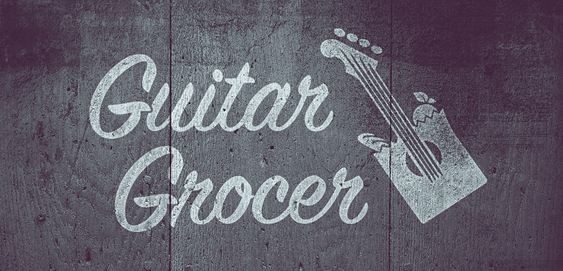
Logo Design: Guitar Grocer
This is a logo design project for a fictional business called the Guitar Grocer.
01
02
03
04
05
06
07
08
09
10
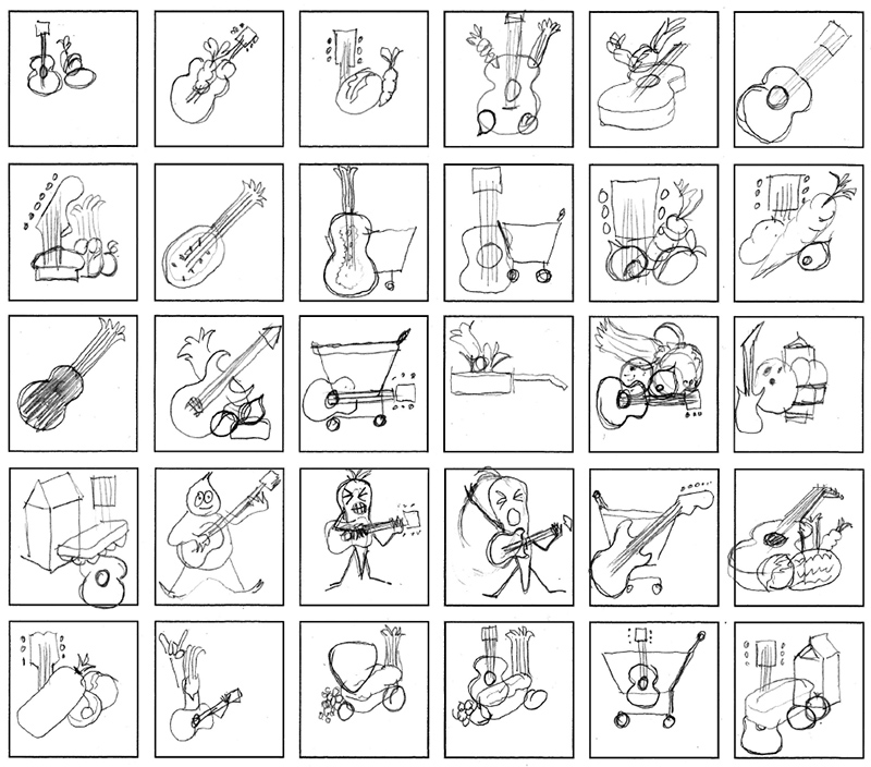
Sketching
In most cases, sketching is a form of brainstorming. It's how I loosen up my brain and get it thinking about a shape language. The concept of a grocery store owned by a guitar player that emphasized the guitar in the name of the store was a unique challenge to deal with when it came to designing a logo and brand identity.
For logos, I like to keep the shape elements as simple as possible, though in the sketch phase this isn't as much of a concern as I am just trying to rapidly get ideas down, though I am always thinking ahead as I work. I like to do a few similar variations of each idea and then try to come at it in as new a direction as possible. Ideally, attempts are made to integrate the two shapes representing "guitar" and "grocer" and combine them in interesting ways.
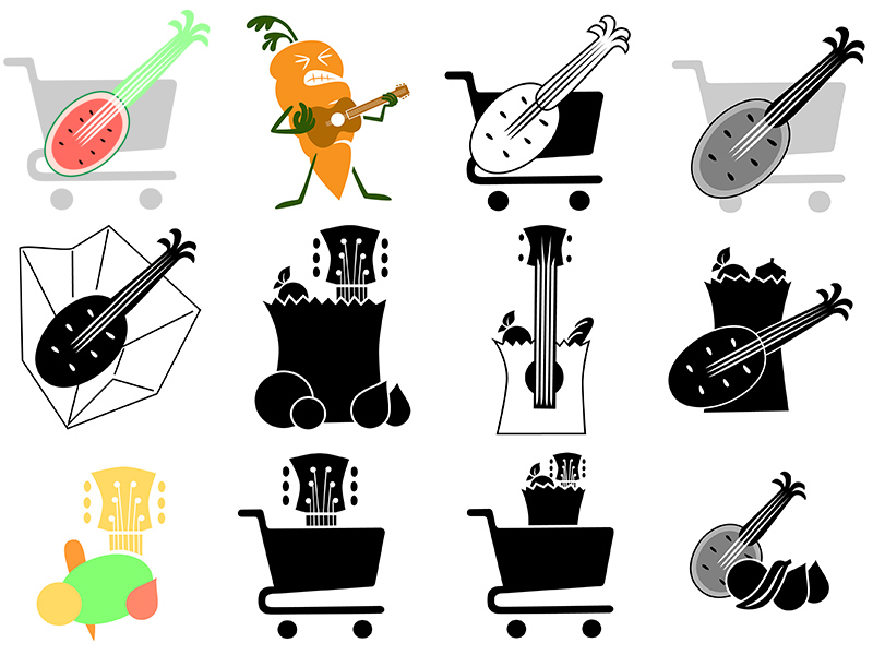
Digital Mockups
With several possible directions in the sketches, some digital mockups are made to test the visuals. In this stage problems become evident and new directions are formulated. The rock and roll carrot for example was a lot of fun, but as a shape it is very complex, so I decided to drop it after this stage.
Other more simple experiments are looked at and tested with color and black and white treatments.Usually, logos can be developed in black and white before even thinking about color, but it is important to be thinking ahead about color to be able to integrate color quickly when it is time to consider color and value.
Light Designs
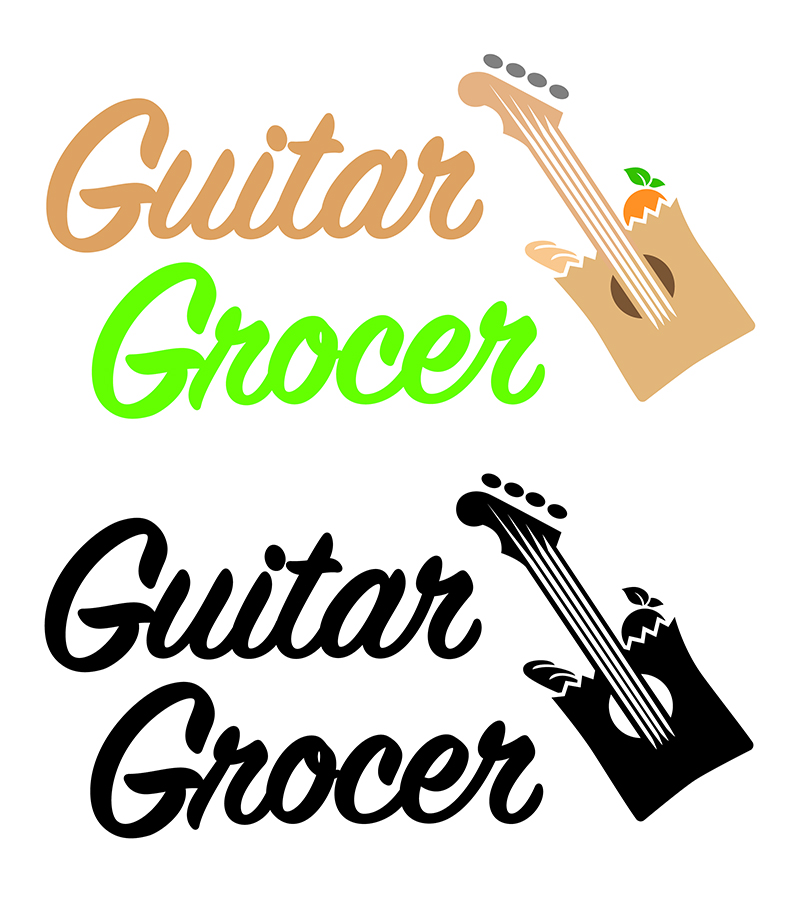
After working through several different directions, I arrived at an integrated shopping bag and guitar design. When choosing a typeface for the brand name, I leaned toward a sign-painting script style that reflects the hand painted signs that are often seen at the vintage corner grocery stores.
This type facilitated an offset text which catered to a rotated alignment for the guitar which is its natural position while being played. When these problems were worked out, it was time to consider all conditions in which the logo might appear in both black and white, and color treatments. When printed on stationary and in print, the logo is usually printed on a light background, so this needed to be worked out.
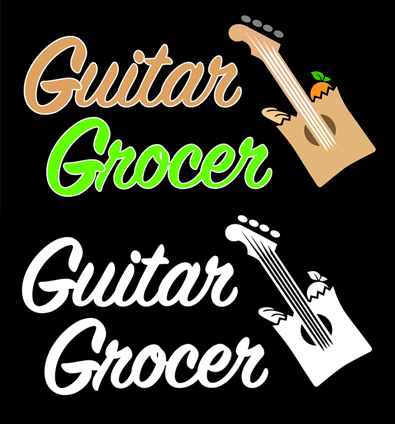
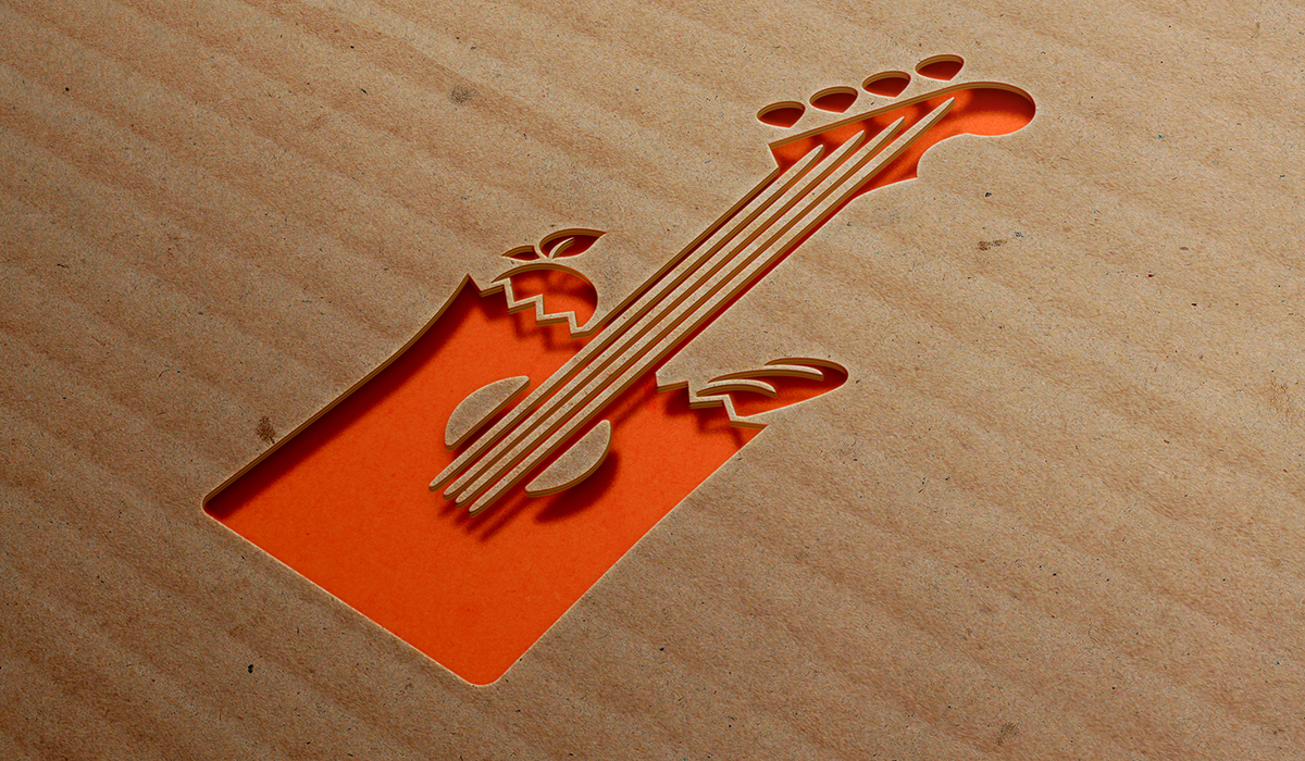
Dark Designs
For the cases where the logo needs to appear on a dark background, some additional elements can be required. For the black and white, many times this is a simple matter of inversion.
For the color version, the addition of a white stroke around text elements helps the readability against the dark backgrounds.