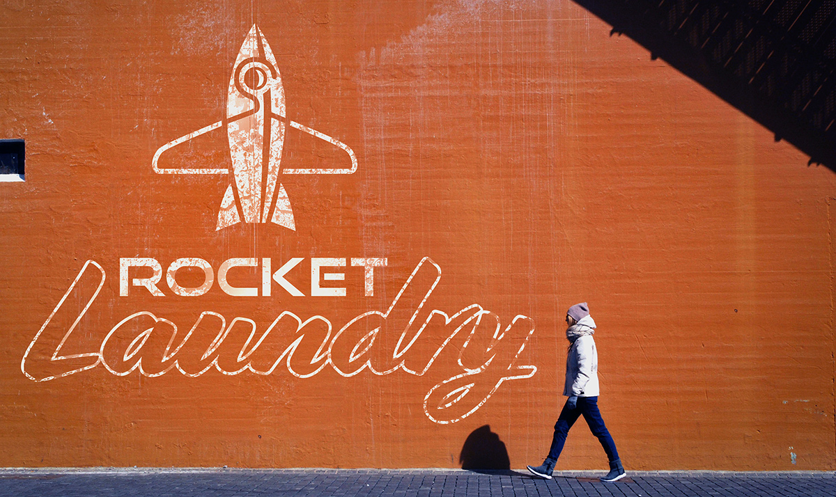
Logo Design: Rocket Laundry
This project is a logo design for a fictional business called Rocket Laundry.
01
02
03
04
05
06
07
08
09
10
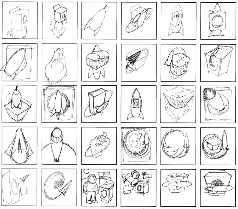
Brainstorming & Sketching
In most cases, sketching is a form of brainstorming. It's how I loosen up my brain and get it thinking about a shape language. The concept of a quick operating laundry service seemed like a fun challenge to take on when it came to designing a logo and brand identity.
For logos, I like to keep the shape elements as simple as possible, though in the sketch phase this isn't as much of a concern as I am just trying to rapidly get ideas down, though I am always thinking ahead as I work. I like to do a few similar variations of each idea and then try to come at it in as new a direction as possible. Ideally, attempts are made to integrate the two shapes representing "rocket" and "laundry" and combine them in interesting ways.
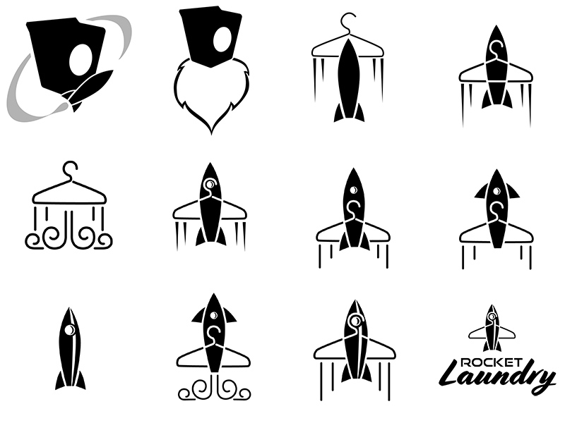
Digital Mockups
With several possible directions in the sketches, some digital mockups are made to test the visuals. In this stage problems become evident and new directions are formulated. The spaceman doing laundry was cool but not "rocket" enough, and as a shape it is very complex, so I went away from this idea. The rocket dryer was also not rocket enough but the idea of integration was taking me in the right direction.
Simple shapes are always more desirable so the rocket in a 50s sci-fi style was working, but I didn't have a simple "laundry" shape until happening on the hanger. Since it's basically shaped like an airplane wing, it could be integrated with a rocket shape rather easily. Usually, logos can be developed in black and white before even thinking about color, but it is important to be thinking ahead to be able to integrate quickly.
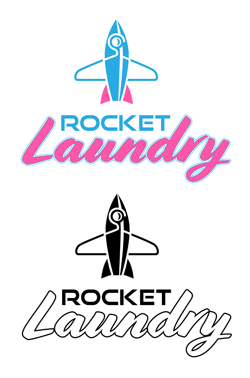
Light Designs
After working through several different directions, I arrived at an integrated rocket and hanger design. When choosing typefaces for the brand name, I leaned toward a sign-painting script style for "Laundry" because it is soft like fresh laundry and a modern sci-fi typeface for "Rocket".
This type facilitated an integration that allowed "Rocket" to fit between the "L" and the "d", providing a launch platform for the rocket hanger graphic above them. When these problems were worked out, it was time to consider all conditions in which the logo might appear in both black and white, and color treatments. When printed on stationary and in print, the logo is usually printed on a light background, so this needed to be worked out.
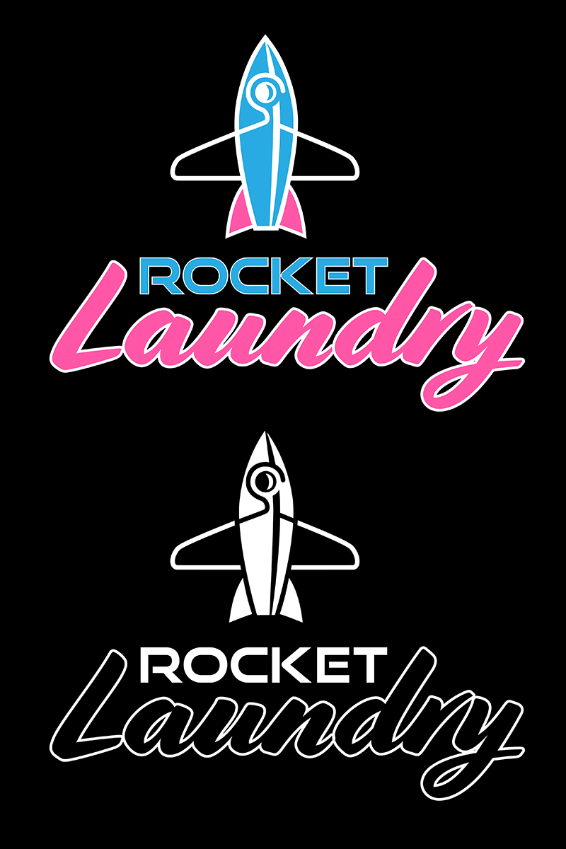
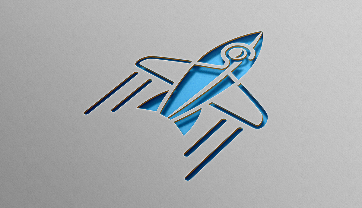
Dark Designs
For the cases where the logo needs to appear on a dark background, some additional elements can be required. For the black and white, many times this is a simple matter of inversion.
For the color version, the addition of a white stroke around text elements helps the readability against the dark backgrounds.